Public version 5
Making a personal site is like overexposure to sunlight. Re-styling a personal site is like peeling dead skin off a sunburn.
May 4, 2023
Read more
Who said the Web can't have physical interactions? Let's experiment with CSS media queries to improve the case study viewing experience on mobile.
• 9 minute read
Let's do the demo first. If you just happen to be reading on a smartphone, I'm guessing it's being held vertically, in portrait orientation: You should be able to see the little component below.
Try rotating your phone. 🪄
And then rotate it back. ✨
If you're reading from literally any other kind of device, the component you're not seeing looks like this:
When rotating a smartphone to landscape orientation, the component disappears. It reappears again in portrait orientation.
Out of context, it's really not all that magical, but I was encouraged to document the discovery and use case, and if only to be my own future hype man, how I figured out how to build it.
Lurking in the shadows on this site is a set of hand-coded case studies on product design. They could've been shipped by now on Webflow or Squarespace — tools I've used before — but I have no Easy mode with personal projects. After years of working up against the bloat and flagging performance of dynamically-loading web apps, I wanted to scratch an itch for hand-spun web development. Eleventy came a-calling as the new hotness in static site generators right around the same time.
This has become a labor of love. The more I've learned and understood, the more I've refined. I'm finding a groove. I think maybe it's time I share something I'm figuring out, and pay forward the gift of learning publicly, like Sara Soueidan or Josh Comeau, or the dozens of others who've been inspirational to me these last several months. Or maybe I'm just procrastinating again.
As a user experience designer, you inevitably solve problems for apps and web apps built for desktop operating systems. When I'm turning these into case studies, I spend a lot of time fiddling with screenshots that are too dense or too large to be legible on mobile devices. It turns out that most desktop software vendors stop at having their screenshots fill the width of the page on mobile and call it a day.
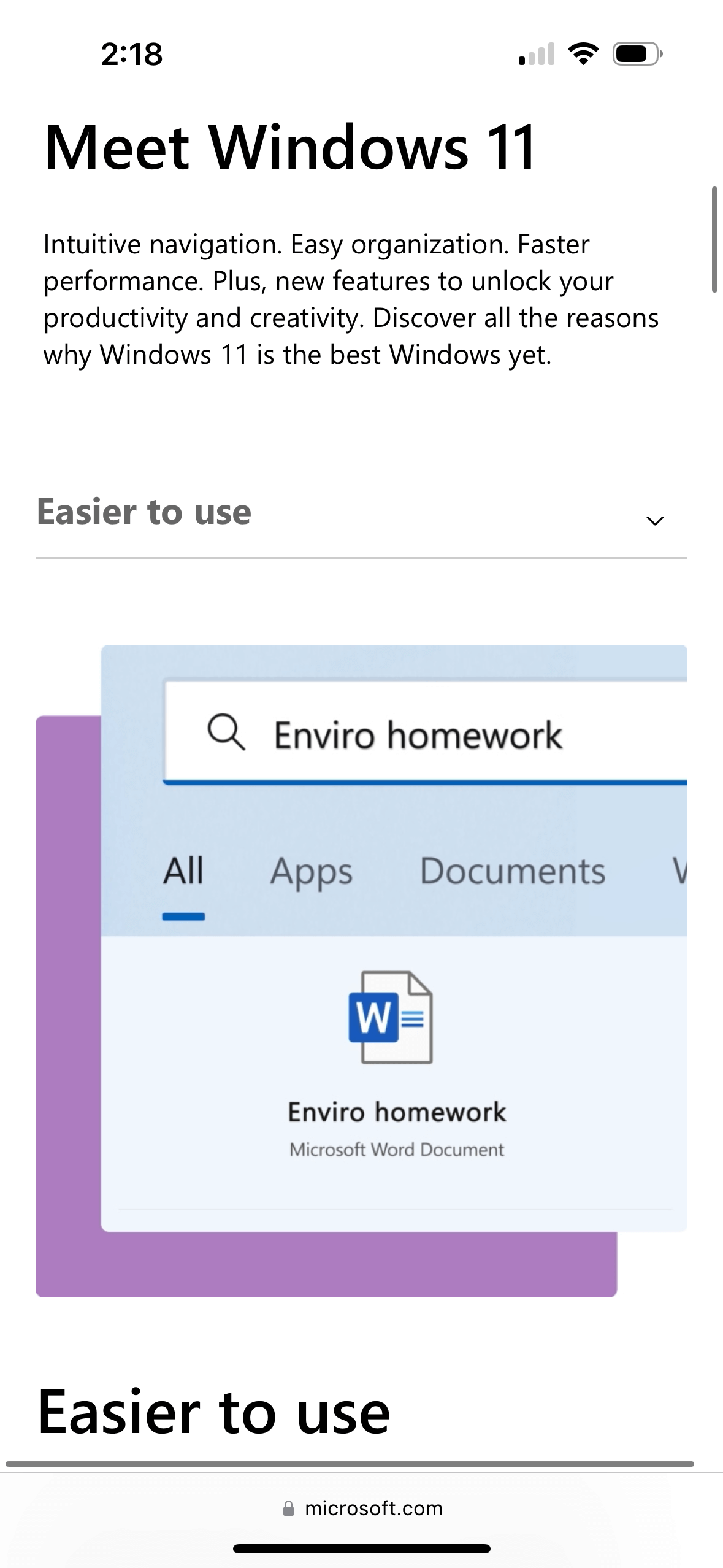
Across every site, screenshots were almost perfectly legible when the phone was oriented in landscape. The team behind Microsoft's "Meet Windows 11" site put in effort to create cropped, animated images of the critical UI for each section.
Great idea, but this is not a solution that works for establishing shots. I also need something cheaper. I wanted to see if I could try to make a simple little interactive something to suggest directly to the user to perform the physical task, in lieu of assuming that they (you; us) would rotate or pinch-and-zoom passively.
Going into this, there were two easy assumptions to make:
My hypothesis was just as simple:
When you're browsing the web, but not a web app, can you be prompted to rotate your device when the content is better viewed in landscape orientation? Is there any reason not to?
I couldn't turn up any hard, fast rule stating that patterns like this were discouraged. A truly great website (and I would argue that mine is not) brings something new and interesting to the table without abandoning and alienating the user. I think a part of what makes building for the web so fascinating and challenging is that websites can use its canvas to paint an experience any way its programmers have the patience to create. Experimentation is encouraged; testing is strongly recommended.
My requirements for this site include ensuring that mobile users are not left feeling short-changed, and that zero JavaScript is delivered to the end-user. If CSS media queries cannot deliver the environmental information I needed for this component, I would simply go back to the drawing board.
The W3C was way ahead of me, indicating that I was not the first person in 15 years of mobile-first web design to think of these things.
Can I ask the browser to tell me the physical orientation of the device?
Yes! The W3C created an orientation query with the values landscape or portrait.
Let's slap together a test component:
<div class="rotate-view">Rotate for a close-up.</div>We'll also use display in CSS to toggle whether the component is visible by switching between block and none. I set the site default to none.
/* hides the prompt for smartphones in portrait to rotate to landscape */
.rotate-view {
	display: none;
}
Then, below that on the stylesheet, I added the rules for portrait-oriented devices to display whatever's using the rotate-view class:
@media only screen and (orientation: portrait) {
	.rotate-view {
		display: block;
	}
}
A real break-you-out-of-your-bubble moment: we live in a time when desktop monitors can be optionally oriented vertically. This might report back to my site and display the component in the wrong circumstances. I needed more specificity.
Can I ask the browser to tell me if it's a touchscreen device?
You bet, pal. Once again, the W3C gave me two @media queries that work in tandem: hover: none and pointer: coarse. Smashing Mag's Cristian Diaz helps us understand hover like this:
none detects when the primary input mechanism can’t hover or can’t conveniently hover, like most cellphones and tablets.hover detects when the primary input mechanism can hover over elements (for example, desktop computers, laptops, and smartphones with a stylus).The options for pointer are explained in the same article as the following:
none detects when the main input mechanism doesn’t have a pointer device (for example cellphones);coarse detects when the main input mechanism has a pointer device with limited accuracy (like the remote control of a Smart TV or some video game consoles);fine detects when the primary input mechanism has an accurate pointer device (like a mouse, touchpads, or stylus).Great! I can filter out devices with mice and cursors. We're going only for devices with cudgels for inputs. I'll take both. The test code evolved into this:
@media only screen and (hover: none) and (pointer: coarse) and (orientation: portrait) {
	.rotate-view {
		display: block;
	}
}
But in testing, tablets were still filtering through and displaying the component. Duh. As portrait-oriented smartphones are safely below ~768px in width (relatively), I added a max-width of 44em, or 704px. I also learned in testing that not all smartphones report pointer accurately, so I broke out the query to include coarse and none with an or operator.
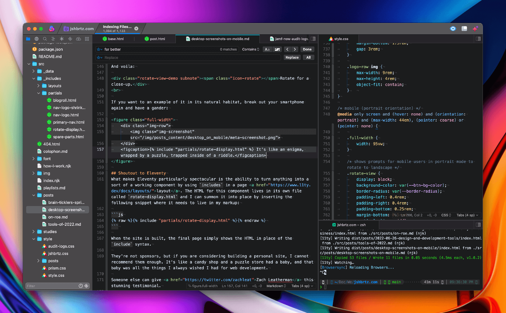
Here's where we ended up. For this final example, I'll include styling and variables:
/* mobile (portrait orientation) */
@media only screen and (hover: none) and (orientation: portrait) and (max-width: 44em), (pointer: coarse) or (pointer: none) {

	/* shows prompts for mobile users in portrait mode to rotate to landscape */
	.rotate-view {
		display: block;
		background-color: var(--btn-bg-color);
		border-radius: var(--border-radius);
		padding-left: 0.4rem;
		padding-right: 0.4rem;
		padding-bottom: 0.13rem;
		margin-bottom: 0.5rem;
		vertical-align: middle;
		max-width: fit-content;
	}
}
Now, let's add a class for styling. You know what? I'll make an icon, too:
<div class="rotate-view subnote"><span class="icon-rotate"></span>Rotate for a close-up.</div>And voila:
If you want to an example of it in its natural habitat, break out your smartphone again and have a gander:
What makes Eleventy particularly spectacular is the ability to turn anything into a sort of a working component by using includes in a page layout. The HTML for this component lives in its own file called rotate-display.html and I can summon it into place by inserting the following snippet where it needs to live in my markup:
{% include "partials/rotate-display.html" %}When the site is built, the final page simply shows the HTML in place of the include syntax.
They're not sponsors, but if you are considering building a personal site, I cannot recommend them enough. It's like a candy shop and a puzzle store had a baby, and that baby was all the things I always wished I had for web development.
Someone else can give Zach Leatherman this stunning testimonial.
Did this make sense? Was it worth my time to write it and yours to read it? Could I have done something better or smarter? I want to hear it all. Shoot me an email or buy me a coffee. ☕️
Making a personal site is like overexposure to sunlight. Re-styling a personal site is like peeling dead skin off a sunburn.
May 4, 2023
Read more
Food is what animals offer to help each other stay strong. Cooking is the act of offering strength with love.
March 31, 2023
Read more
Who said the Web can't have physical interactions? Let's experiment with CSS media queries to improve the case study viewing experience on mobile.
October 16, 2022
Read more